Foundation Shade Match Checklist: Undertone & Depth Guide
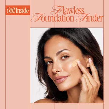
Flawless Foundation Finder: A Digital Checklist for Shade Matching and Undertone Clarity
Foundation should disappear into the skin—no mask lines, no orange cast, no gray haze. The most seamless matches come from a repeatable process: identify undertone, select depth, choose a finish that plays well with your skin type, then test in real-world lighting. Use the steps below as a quick digital checklist you can follow every time you try a new formula, shop online, or notice seasonal changes. For more guidance, see A Beginner’s Guide to Finding Your Perfect Foundation Shade.
What “flawless” foundation matching actually means
- A good match aligns with both depth (how light/dark) and undertone (the subtle hue beneath the skin).
- A correct shade looks balanced across face, neck, and chest—especially at the jawline, where mismatches show fastest.
- Oxidation can shift color after application; checking at 5–15 minutes helps avoid surprises.
- Lighting changes everything: warm indoor bulbs can hide a mismatch that daylight reveals.
Step 1: Find undertone using simple, repeatable checks
- Vein check: blue/purple often reads cooler; green often reads warmer; a mix can indicate neutral/olive.
- Jewelry test: silver tends to flatter cooler undertones; gold tends to flatter warmer undertones; both can flatter neutral.
- White vs. cream fabric test: bright white can emphasize redness on warm skin; cream can look dull on cool skin—use this as a clue, not a rule.
- Sun response: burning more easily can correlate with cool/pink tones; tanning more easily can correlate with warm/golden tones (still not definitive).
- Olive undertones: can look “neutral” in some tests but turn foundations peach/orange—watch for that specific mismatch.
Undertone clues and what to try first
| If you notice… | Undertone clue | Foundation undertone labels to sample |
|---|---|---|
| Pink/red cast, face looks flushed next to neck | Cool | C, cool, rosy, pink, porcelain |
| Golden/yellow cast, skin looks brighter in warm light | Warm | W, warm, golden, yellow, honey |
| Both gold and silver jewelry look fine | Neutral | N, neutral, beige, balanced |
| Foundations pull orange/peach or look “off” despite correct depth | Olive/neutral-olive | Olive, O, neutral-olive, golden-olive (avoid overly peach tones) |
Step 2: Choose the right depth (lightness) before fine-tuning undertone
- Match depth to the neck/chest area to avoid a floating face effect.
- Start with 2–3 adjacent shades; the right one typically “vanishes” at the jawline.
- If between shades: dry skin often prefers the slightly lighter option; oily skin can sometimes handle slightly deeper if oxidation is common.
- Seasonal shifts are normal—keeping a summer and winter depth can look more natural than forcing one shade year-round.
One practical trick: if your face is naturally a touch deeper than your neck (common with sun exposure), choose a shade that matches the neck and add warmth back strategically with bronzer. It reads more believable than a deeper all-over base that changes your neck color. For further reading, see Undertone: How to Match Foundation to Skin Tone – Jane Iredale.
Step 3: Pick a formula that suits skin type and finish goals
- Oily/combination: look for long-wear, soft-matte, oil-free, or “natural matte”; set only where needed (usually T-zone).
- Dry/dehydrated: look for hydrating, luminous, serum, or “skin tint” style bases; avoid heavy setting powders that dull glow.
- Textured skin: medium coverage with a natural finish often looks smoother than very matte full coverage, which can emphasize texture.
- Sensitive/acne-prone: prioritize non-comedogenic claims when possible and patch-test new products.
For irritation awareness and best practices around cosmetic reactions, review guidance from the American Academy of Dermatology Association. For general cosmetics safety information, the U.S. Food & Drug Administration is also a helpful reference.
Step 4: Shade test like a pro (so you don’t guess wrong at checkout)
Common foundation mismatches—and how to correct them quickly
Use the Flawless Foundation Finder digital checklist to lock in your match
If you want the steps in a quick, reusable format, Flawless Foundation Finder – Digital Checklist organizes undertone identification, depth selection, and lighting checks into a printable-friendly digital guide. It’s designed to reduce trial-and-error when buying new bases—especially when you’re comparing brand undertone labels that don’t always match each other.
Bonus digital tools to keep routines consistent
- Speak Success: Your Power Words Action Checklist for a quick, repeatable daily reset before busy mornings.
- Break Free: Stop Self-Sabotage Today if sticking to new habits (like consistent skincare that affects makeup wear) is the hardest part.
Quick pre-purchase checklist (especially for online shade matching)
FAQ
How can undertone be identified if veins look both blue and green?
Mixed vein color often points to a neutral undertone, but it can also indicate olive. Use multiple checks (jewelry, fabric, and—most importantly—how swatches wear) and note whether foundations tend to turn orange, pink, or gray after 10 minutes.
Where should foundation be tested for the most accurate match?
Swipe from cheek down across the jawline and slightly onto the neck, then compare against the chest in daylight. Re-check after 5–15 minutes so oxidation and texture settling are part of the decision.
Why does foundation look darker or more orange later in the day?
Oxidation can come from the formula reacting with skin oils, skincare underneath, or simply long-wear pigments deepening as they set. Try a primer that fits your skin type, reduce heavy oils under makeup, and test a shade that starts a touch lighter or more neutral.






Leave a comment